
On the previous page Show me the money I indicated that the leaked confidential Bentleys reports had shown profits increasing by 159% in 2014 and another 40% in 2015. They reported that Registered Nurses (RNs) were being replaced by Personal Care Assistants (PCAs). From what was reported in the press, I guessed that staffing levels might be as low as 1.6 hours per resident per day.
The Queensland Nursing Union (QNU) has clearly seen the full report. In their submission to the Senate Workforce Inquiry in 2016 they indicated that the average percentage of high care residents in these facilities was 70% and the level of direct care was 2.86 hours.
The top 25% of performers’ (ie most profitable) facilities reported 78% high care residents and provided less care - only 2.77 hours. The QNU contrasted this with the 6.09 hours (more than double) supplied by a government owned high care nursing home in Queensland.
Studies in the USA have shown that staffing levels below 2.9 hours per resident per day placed most residents at risk of harm. Their minimum safe level was 4.1 hours but they indicated that residents in need of high care would need more than this so the average would be higher with a greater percentage supplied by RNs.
In the slider section "A very Profitable industry", on the page Show me the money, I quoted and linked to a press report, a presentation and to StewartBrowns Aged Care Financial Performance Survey report which presented a very different picture to the Bentleys' survey. After I had read the benchmarking summary in the report, I gave up on the intricacies of benchmarking and left the details to any reader who could understand it. That was a big mistake because it was filled with information.
StewartBrown are Chartered Accountants listed in the BRW top 100 accounting firms in Australia. Their mission is to provide practical, professional and personable advice. They focus on aged care and perform regular industry surveys and generate “benchmarking” reports to help providers compare and improve their financial performance.
I was alerted to my mistake at the beginning of November when Pxxxx Rxxxx responded to a tweet post from Aged Care Crisis copying it to the senate where there is an Inquiry into Australia's Aged Care Workforce Issues in progress. He attached detailed information about staffing going back several years.
Pxxxx Rxxxx was CEO of the industry body LASA from February 2013 to April 2016 when he took up the post of Director - Aged Care, Community & Disability at StewartBrown in May 2015. He has a distinguished background in pharmacy, is a proprietor and partner in “the largest private pharmacy grouping of its kind in Australia”. He has been Vice President and then later National Director of the Pharmacy Guild. He is ACT Branch President Pharmaceutical Society of Australia.
While with LASA he was involved with government and was appointed by the minister as Chairman, Aged Care Workforce Advisory Group and by the ACT to their Ministerial Advisory Council on Ageing. Rxxxx's LinkedIn profile states the following: My intimate understanding of the strategic and technical issues within ageing, business and association management, and of the challenges as a business owner in today’s economic and political environment, give me the unique ability to plan, direct, monitor and evaluate the impact of policy and regulation change.
Rxxxx has been at the heart of aged care policy. I am providing this detail so that readers can understand clearly where he is coming from and how we differ in the way we see things. This is not an attack on Pxxxxx or StewartBrown as I would probably look at it the same way if I had his background and lack of experience in actual care.
Since 2007, StewartBrown has been collecting detailed information about staffing levels in Australia and providing it to the industry. During that period Aged Care Crisis and numerous other critics have been complaining bitterly about the secrecy around staffing levels. Vast numbers have complained about staffing yet neither they, the nurses or the newspapers report had found this. Some of these reports have been publicly available. Undoubtedly this is because of the density and complexity of the benchmarking. In addition, no one in Australia understood their significance because we don’t have minimum levels to measure them against. It was time I got my head around this.
What emerges is:
- Details of what has been happening in staffing in Australia
- Why the StewartBrown report is so different to the Bentley’s report
- The totally different way that I interpret this data when compared with Pxxxx Rxxx, StewartBrown and the industry that reads the reports and follows their advice. I think most citizens would see it my way if they had the background and understood the significance of the figures. This wide difference in the way we understand what is happening and the inability of one group to accept the views of the other as credible is one of the reasons why I think aged care has become a culturopathy. This is characteristic.
Analysing staffing figures
Background: When ACC responded to Pxxxxx, they tweeted “Independent figures vary & NOT transparent or verifiable” to which Pxxxxx responded “Hardly. Non partisan FACTS from only independent survey of RACF numbers”. So we should start with a look at possible biases when we look at "facts".
Reliability of data
Most of the data collected by all of these surveys is self-reported and self-selected. The providers reporting on the data not only supply the data, but volunteer to do so and at least in the case of StewartBrown pay between $400 to $1000 to join the study and then from $400 to $680 per facility annually depending on the number owned. There is nothing to suggest that this data is based on verifiable facts and given that both StewartBrown and those it surveys have a very considerable interest in the outcomes for themselves, it cannot be non partisan.
As far as we can ascertain, the information and advice is not independently validated or audited either financially or by anyone whose prime interests is in the consequences for residents. The benchmark figure used by StewartBrown has been presented in Court as evidence. The court rejected its validity. The court found that a facility achieving these benchmarks was representative of a problem of widespread understaffing in the sector and that the benchmark was not “realistic”.
We have not found any information suggesting that these benchmarks have been validated against outcomes or the risks to residents. Internationally this has been done, but Australia has ignored their recommendations.
... I can only reconcile the two categories of evidence by concluding that, at least in the Manor, the industry benchmarks for adequate staffing did not provide for a realistic workload of the staff nor the ability to fulfil all of their tasks. On a wider scale, the evidence suggests that staffing levels are often inadequate across the aged care industry. The evidence also indicated that staff absenteeism was a significant factor in reducing staffing levels to below what was adequate to provide proper resident care. Again, the evidence gives me no reason to believe such an issue is confined to Vaucluse Gardens ...
Source: Coroner, Record of Investigation into Death (With Inquest), Magistrates Court of Tasmania, Coronial Division (1 Sep 2016)
Representational bias: The group may not be representative. The 2015 StewartBrown report indicates that:
"... The majority of facilities in the survey are not-for-profit organisations. While the results of the top quartile compare well with the for-profit sector, the not-for-profit sector is over-represented in the facilities that do not perform well financially ..."
They don’t give the numbers. If in contrast, the majority of providers in the Bentley survey are for-profit, then this would be an excellent example of the difference between the two because that is what you would expect if you look at what is happening in the for-profit marketplace. But we don’t know. What we do know is that in the StewartBrown report we are looking at figures largely based on the not-for-profit sector.
International studies suggest that the private equity and market listed for-profits will sit at or above the upper level of this study in profits and at the lower level in staffing – but we don’t know for certain. The top quartile are likely to be those that are emulating the for-profits. One of the reports shows that this quartile are as profitable as our market listed corporations. Staffing levels are not given.
Self-reporting bias: When everything is equal most people will try to give an honest and fair answer within the limits of the way they understand it. In the section on data I will be writing about the way the language we use and the way we conceptualise things can lead us to see the same things quite differently to others. The surveyor can ask and interpret differently and the surveyed can see and understand differently. This sort of bias is often called confirmation bias. We look for what we think is important, see what we expect to see and overlook what we don’t expect or readily understand. So businessmen and analysts collect financial data and not data about care --- and even when that data gives information about care, they don’t see it. Families and community want to know about the care given and their only concern about finance is the cost they have to pay.
Example: RSM Bird Cameron and PricewaterhouseCoopers was commissioned by The Aged Care Financing Authority (ACFA) to do an analysis of the 2012-13 financial statements of providers. They divided them into quartiles (4 groups) based on their profitability with the most profitable being good and the least bad. The least profitable group were not only charging (government and customer) $17,000 less than the profitable group, but they were spending nearly $11,000 more on looking after the residents – a benefit of nearly $28,000 per resident. Surely this was much better value for government and customer than the good group who charged more and spent much less on care. But the report saw that as bad and reported that to ACFA who presumably accepted it and based policy on it.
Related: ACFA Report - Factors influencing the financial performance of residential aged care providers 2015
Background and purpose of survey
It is important to look at what StewartBrown and the industry are collecting the data for. Over a number of years, the format of the results of the survey has changed. However, at all times the predominant purpose has remained the same, that is, to provide a tool to assist management to improve financial performance.
It is important therefore to understand that StewartBrown is advising and helping these companies to improve their financial performance and are not giving any advice or information about what the consequences of this advice will be for others. It is not going to provide information or interpret data in ways that are not in their best financial interests.
Although it does not advise on reducing staff numbers and it indicates that this is limited by the needs of residents, it clearly graphs the staffing levels of the providers comparing this with their benchmark providers which have a lower ratio. Nursing salaries are every nursing homes highest cost and the implications of not keeping staff levels low are made clear. The message is to make it as low as you can manage. This is good financial advice, but the pressures it places on facilities is very dangerous for residents. The pressure is to provide the minimum that the accreditation process will accept - a recipe for mediocrity.
StewartBrown's Aged Care Financial Performance Survey Registration Kit 2016, clearly outlines that the results of the survey may be used for other purposes:
The information is self-reported with the knowledge that it may well be used to lobby and to form policy which might impact on profitability. This limits the way that data will be reported and introduces bias.
The StewartBrown reports look at staffing levels by bands but do not compare the staffing levels in the profitable groups with the unprofitable ones in the same way as they compare finances. This is critically important information and would reveal any adverse consequences of financial policies. But this is not the way the market thinks and behaves.
Since the early 1970’s when economist Milton Friedman first published his influential ideas about markets and condemned social responsibility as evil, it has become a dirty word. While executives might claim to be socially responsible this is not built into the marketplace that was developed in the 1980s and 1990s. Managers do what is expected of them without thinking of the consequences for society or its citizens. We need to remember this when looking at these reports.
Bias due to incentives: But in the marketplace and in the community there are always incentives and disincentives, especially in a strongly competitive marketplace. Sometimes management deliberately creates them.
The accreditation process is notorious with numerous accounts describing how it can be gamed. Every loophole that can be found in the funding system is maximised by enterprising providers, whether in the US or Australia (see Consequences of marketplace thinking). Quality Indicators (QI) are largely self-reported.
In 2004, Latrobe University evaluated the potential of QI’s in aged care for the Victorian Department of Human Services. The report warned that “a punitive approach will only result in low compliance and inaccurate recording".
Nothing can be more punitive than having your poor performance exposed in the marketplace. This is exactly what happened in the USA in 2014 where QI's are publicly reported. It was found that the highest ranking facilities were in fact the worst. Only one of the QI’s was verifiable. The USA found that it was able to check the staff levels using payroll data that the government collected. It abandoned some of the unverifiable self reported QIs used.
The influence of marketing gurus: The success of businesses in the aged care industry is based on image and there are a multitude of credible and persuasive marketing and advertising experts telling people how to use words and what to say to make things look good and avoid creating a bad impression. One of the simplest ways of creating an impression is to play around with words so that the people you are targeting think that you are talking about something else. In doing so you hide the information you would rather they did not know.
The industry is under attack. Vast numbers of nurses are speaking out, citizens are unhappy, there are letters and reports in the press almost daily and the senate is conducting an inquiry. There are strong pressures on the system to fudge the figures.
Collecting accurate data
With so many potential biases, we do need to have some on site way of checking the validity of the data that we collect. In the section of data collection I discuss these biases and give more examples and then show how a local partnership between community and government, which we have called a Community Aged Care Hub, would work quietly in each facility collecting and collating data for the facility and so ensure that what was reported was accurate.
What figures are we talking about?
We need to be quite clear what we are talking about when we present figures on staffing and care. Clear international standards have been set out in the USA. Care in the USA is provided by three roughly equivalent staffing groups to Australia, fully trained RN’s, trained but less experienced licensed vocational (LYN) and practical nurses (LPN) {Equivalent to Enrolled nurses} and Certified nursing assistants [CNAs) (Presumably included under “Other Care Staff “ by StewartBrown but really PCAs). As Australia does not have any equivalent benchmarks, we need to use these for comparison.
Research at the beginning of the century showed that below 4.1 hours per resident per day might provide a level of care that “results in harm and jeopardy to the residents”. Another federal study showed that below 2.9 hours, most residents "needlessly suffer harm." The U.S. Centers for Medicaid and Medicare Services (USCMS or usually CMS) has minimum recommended standards and average expected acuity. Sufficient RN’s are most important and their hours are expected to increase with greater resident acuity.
Industry lobbying has prevented these minimum levels becoming compulsory but some states do have legislated minimum levels - the highest is 3.5 hours in California. Large market listed and private equity groups seem to ignore these figures and instead try to use the inadequate state minimum levels to defend themselves in court. In Australia they have tried to use industry benchmarks.
|
|
RN |
LYN/LPN |
CNA |
Total |
|
Recommended minimum standard |
0.75 |
0.55 |
2.8 |
4.1 |
|
Average expected staffing based on acuity |
1.08 |
0.66 |
2.43 |
4.17 |
Note that the ANMF are currently working in partnership with Flinders University and the University of South Australia to develop recommended safe levels for Australia.
It is important therefore that we try to work out exactly whose working hours are being included in the images of graphs supplied by Rxxx when asked, because I could not find that graph on any of the recent StewartBrown reports.
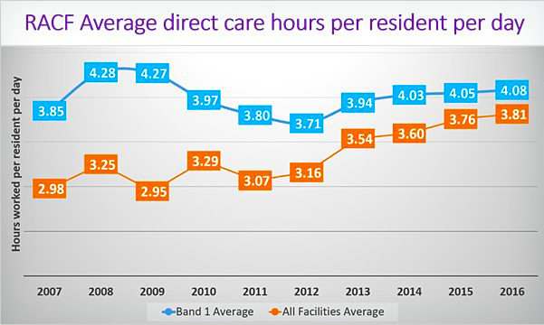
Information supplied: Rxxx supplied two graphs. The one I was particularly interested in was the one headed “RACF Average direct care hours per resident per day” below. They were much better than I expected from the information that I had been getting. I searched through the December 2015 and the March 2016 StewartBrown reports and did not find this graph there but there was a very similar graph headed “Average Care Hours worked per resident per day” which was clearly based on different data. The only difference between the title of the two was the word “direct”. I thought that direct care meant that this was the care that was provided directly to residents by nursing staff but as the figures were on average over 45 mins more care per day this was unlikely.
To understand the graphs you need to understand the way StewartBrown divided up their data based on the income the facilities get paid for providing care. There are 5 bands, so Band 1 represents the 20% paid the most because they have frailer and sicker residents needing more care. These are the homes that in the USA would be expected to push the average higher.
Aged Care Crisis asked for clarification to Rxxx asking him what sort of care was included in the graph he supplied. The material he supplied did not help us much. I therefore went back to the StewartBrown reports I had and gathered the following information:
The figures that were not direct care seem to match what the reports I saw called Total Care Hours. These included care provided by RNs and “other care staff”. It also includes “Care Management” and care given by “therapists”. Clearly this is not direct nursing care as measured in the USA although the difference is not large. I think it is clear that the Dec 2015 StewartBrown graph shown below is the average of the Total Care Hours per person per day as self-reported by those in the survey. The figure we need to concentrate on below is the average which shows how woefully inadequate our staffing levels are. But even Band 1 falls way below the minimum recommended US levels.
- I tried to estimate the average number of hours of actual nursing care by subtracting “Care Management” and “therapists” from the figures given for the five bands. I then averaged the five bands to give a figure for actual nursing care given. This should give a rough working figure provided that the five bands have roughly equal numbers in them.
The graph produced below brings all of this information together. To the original “Average Care Hours worked per resident per day” graph from page 11 of Stewart Brown’s Dec 2015 report, I have plotted or added:
- The figures from Band 1 from the “direct care hours” supplied by Pxxxx Rxxx
- The figures from “all facilities” from the “direct care hours” supplied by Pxxxx Rxxx
- The rough estimated actual nursing time provided by staff doing nursing by subtracting management and therapists time using the four reports I had found.
- To the layout of the graph I have added lines representing:
- The minimum recommended safe nursing hour level advised by the US Centers for Medicaid and Medicare Services. Studies they did showed that below 4.1 hours “some” residents were at risk of harm.
- The level of 2.9 hours which an 8 year US government study found was the level below which most residents were at risk of being harmed.
- The StewartBrown benchmark for total direct care hours of 3.18 hours (Dec 2015) less the management and therapists time. This comes to 2.93 hours drawn in red. It is only a fraction above the 2.9 hours danger level in the USA.
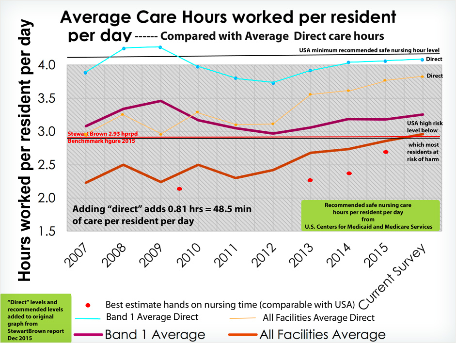
- Note 1: that on average 0.81 hours (48.5 minutes) - almost another hour of care – is given to every resident every day when it becomes “direct”. We are of course very interested to know what this additional care is.
- Note 2: StewartBrown also lists the following items such as: Hotel services, Accommodation services, and Administration, which are clearly not part of care. There is an item under the heading of total hours that includes these as well as the total care hours. Now it may be that this is what has been included with the word “direct” but the figures in the report did not allow me to calculate this.
Perplexing contradictions: What was particularly perplexing to me was that on the same page as the graph direct care is closely linked to nursing in the statement "- - the subject of nurses and hours of direct care time have been somewhat topical in recent months". Then again on page 12 of the 2015 report it states quite clearly that "The survey average for total direct care hours worked per resident per day across the 261 facilities in Band 1 was 3.26 hours".
The adjacent pie chart "Band 1 - Mix of care hours" is also labelled with "Total direct care hours" and in the row "survey average" this is given as 3.26 hours. If you look closely at the graph, the line for Band 1 seems to pass very close to if not directly through where 3.26 hours should be. One wonders if terminology has been changed in the last 11 months?
It seems that the Average direct care hours for Band 1 are actually 3.26 hours and not 4.05 hours and the figure for all facilities is 2.85 hours and not 3.76 hours. The figures have been inflated by an average of 0.81 hours (48.5 min) per resident per day.
As a community group, we would consider representing data like that tweeted to senators conducting an inquiry into workforce issues in this way as deceptive, particularly for someone as distinguished as Pxxxx Rxxxx. This material was sent to the community and to parliamentarians reviewing staffing levels without revealing what care was being addressed. It was clearly intended to influence policy. We hope that there is some other explanation.
I sincerely trust that if there has been a mistake, Pxxx Rxxxx will contact those who have been misinformed and correct the error. Even if Rxxx was inadvertently given the wrong graph by someone at StewartBrown, it is very worrying that someone at such an august and reputable organisation would do this and supply Rxxx with the graph. Someone must have been thinking about this deception. Whatever happened to corporate integrity and social responsibility?
- Note 3: There may be differences in training and skills in the different levels in the USA but both countries have 3 levels. US studies show that the RN’s seem to be critically important, the middle group of less trained nurses seems to have much less impact. There needs to be a sufficient number of the lesser trained staff who need supervision but the standard of their supervision by RNs seems to be as or more important than their skills. It is difficult to see how differences in skills could be used to justify the large gap between this and the care given in Australia.
- Note 4: The USA has an even more aggressively competitive free market than we do and its government regulation, although much more rigorous than ours, has failed to make meeting staffing standards profitable. Large numbers of facilities do not meet these standards and provide extremely poor care.
Conclusions
- There are 48 minutes of extra care per resident per day added to the care previously documented as being given by StewartBrown, Rxxxx's employer, in December 2015. The public and the senators conducting an inquiry into workforce issues who were given this data need an explanation. What changed when the word “direct” was added?
- The levels of staffing documented in industry reports fall a long way below minimum recommended international levels for example in the USA. Average levels consistently fall well below the 2.9 hours level which in the USA are considered to pose an unacceptably high risk. Probably only somewhere between 20 and 30% of Australian facilities have been above this level over the years with a slight improvement to nearly 50% recently. In what way are we different?
- The level of staffing revealed strongly confirms the validity of the intense unhappiness expressed by numerous nurses about their struggle to provide care and their concerns about their inability to give the care that is needed. It also confirms the validity of the intense unhappiness and anger that so many families are expressing about the care given to their parents. The numerous press reports are well founded and are accurately describing the consequences of what has been happening.